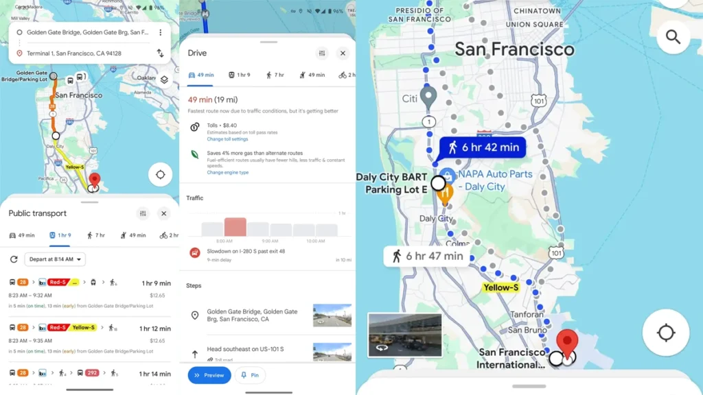
Google Maps is undergoing a significant redesign, particularly in the directions search experience. Tapping on a location now reveals a new sheet design with close and share buttons in the top-right corner, along with a background sheet behind the active one.
The location sheets are no longer fullscreen, providing a sliver of the map background at the top to maintain context. The directions search UI at the top is now dedicated only to entering addresses, creating a less cluttered appearance.

The carousel of transportation methods is now at the bottom for better reachability on mobile, and the UI is no longer fullscreen, allowing users to see more of the map during navigation methods.
While these changes are currently available on some Android accounts, the wider rollout is yet to happen, and the update is expected to come to iOS as well.
For Latest Tech Updates Please follow us :
facebook | twitter | instagram | telegram | whatsapp


